Page views

Thursday, 19 December 2013

Contents Design Drafted Outcome


Final Design

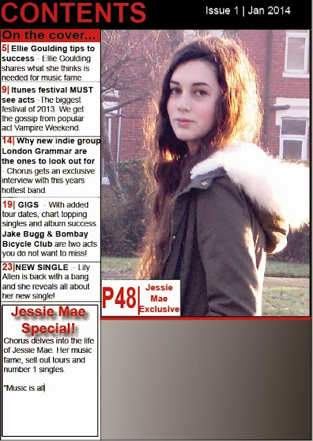
This is my final contents page design. With regards to designing the page, I felt that i struggled a bit compared to the front cover design the reasoning for this is because of the amount of information a contents page includes. However as a final design I am reasonably pleased and feel that it reflects my research and flat-plan design.

Contents Design Draft (2)


Draft 2

This is my second drafting of my contents page, I have not changed much since the previous draft apart from the background colour. I wanted to play around with colour schemes but feel that the white is to exposing and distracts from the text, for my final contents design I think I shall be going back to the grey gradient background.

Monday, 16 December 2013

Contents Design Draft (1)


Draft 1

This is my first draft to the making of my contents page, i was inspired by Q Mag with this design, keeping it simplistic but informative. I am happy with my progress in the design, but unsure to as to how the finished design would look in terms of it being an effective, eye grabbing piece.

Thursday, 28 November 2013

Music Magazine Design Drafted Outcome


Final Design

This is my final front cover design. Since uploading the drafts I have made some changes, the main one being my font choice. 

After printing off my design, I felt that my previous masthead font lacked in design and did not grasp the eye. I have now changed this to a font which is blocky and fits in greatly with my magazine design. As well as this, I have now added all my cover lines and I think that the space does not look too overcrowded. A pull quote and puff and plug has also been used for effective design use.

I am more than happy with my final result and feel that for a first design it meets the requirements of this task, the part I'm most pleased with is the photo of my model. To achieve this image I stuck to the idea of 'Rule Of Thirds' and this technique has given me an effective photo.


Front Cover Design Draft (2)


Draft 2

This is my second draft to the creation of my music magazine front cover. After having made the improvements from draft 1, i feel that it is now more of a suitable magazine front cover. I am really happy with the chalk-duster font and feel it conveys my magazines meaning very well, I used the drop shadow tool for the singers name to give it an emphasis and I think this works very well with the background image. 

Improvement

For improvement I would like to play around with font choices and select a font which i feel is appropriate for my music mag design.

Front Cover Design Draft (1)


Draft 1


Today we started to create our front cover for a music magazine, this is my first draft of my design. In this draft I simply uploaded my image and placed it into indesign, I then started to play around with the masthead design and selected a font. After this I started to produce a cover line, I flicked between colourings and felt that red made it very striking against the background. 

Improvement

I feel that for a fist draft it is coming along nicely, however there would be a few improvements i would make. One key improvement would be the sizing of my masthead, at the moment I feel it out rules the image and I shall making minor adjustments to the sizing of the masthead. I also want to play around with the sizing of my cover line, I feel that it would look better on a smaller scale. This way i am able to fit key information on the design in a larger scale.


Tuesday, 26 November 2013

Photo-shoot


Photo shoot: Here I have uploaded all the photos I have taken during my photo shoots, these are mainly the unsuccessful attempts which don't fulfil certain criteria such as 'rule of thirds.' I have positioned my model in a number of poses to give me an idea of what image I want for the design layout of my magazine, the reasons for the following photos being unusable images also include the fact that in some images my model is not expressing a distinct emotion, the camera angle is distorted as well some blurred photos. However these images are still worth considering when producing my design layout.


Sunday, 17 November 2013

Flatplans


Front Cover Design

This is my flat-plan design for my music magazine front cover. I have include cover-lines which I shall hopefully be using onto this design, I will relate back to this flat-plan when designing my magazine cover.


Content Page Design

This is my flat-plan for my contents page, i want my design to be very simplistic so have opted for the standard grid based layout. I shall have one main image and 2 smaller images on this page as well as a variation of font choice and shapes.


Double Page Spread Design

This is my initial flat plan for my double page spread, I am hoping to have a landscape image spread across the whole page with text overlaying on top. As well as this I would preferably like to have a side image of my artist added to the right of my page.

Saturday, 16 November 2013

Photography


Photography Uses

These two magazine cover designs follow the typical codes and conventions of magazine design however the photographic shot implies difference between these two examples. 

Taking 'The Source' as my first example, I can clearly identify the use of Lines within this photo; the main line in this case is the magazine cover model, who has been positioned carefully to continue the line of the gun that he is holding. Not only is the model a line but you can argue that his clothing, the straps on his vest is also a form of line which leads up to his face. As well as the use of Lines, the photographer has used the idea of The Rule Of Thirds; the position of this models eyes are on an intersect where a third line crosses therefore meaning the human eye is naturally drawn to this area which is commonly referred to as a focal point. A Focal Point can be defined as an area of an image that grasps the eye and makes the eye pause for a few seconds. In this image, i don't think the presence of Angle use is very clear on the human eye however it does show slightly through the photo in terms of the photographer just being that slightly bit lower than the model. Finally this example has stuck to a modernist associated Colour scheme, the reds frame the model and make him stand out amongst the text.

Contrastingly is the other example of Lady GaGa on the cover of Vanity Fair. This time the Rule Of Thirds is very domineering and can be easily seen as Lady GaGa herself is on a Line of a third as well as being a Line herself. This image has been cleverly shot as GaGa frames the text rather than the text framing her, the reason for this is because of the placing of her on this cover design which is to the right. this typically follows the norm codes and conventions as the left third tends to convey information. The Angle in which GaGa has been shot is clever, as the photographer has moved himself to suit the image; GaGa is looking down upon the reader and the reader looks up upon her, to meet the seductive eyes which also are looking down upon. Finally the Colours are very minimal in this design, with GaGas face showing a lot of highlight and tone to it therefore making it a a focal point for the reader.

Conclusion

To conclude both these magazines convey different meanings, but both photos are very strong and hold the eye of the reader. I personally think that the photo of Lady GaGa is more powerful and makes my eyes explore the image before focusing on a particular area, I also think the highlighting of the face is a great emphasis and draws the reader into the third line.